
How Generation Alpha Is Changing Packaging Design
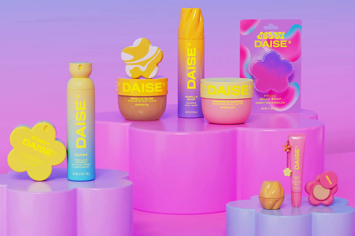
Generation Alpha is influencing packaging with softer visuals, collectible systems, and designs that work across shelves and screens.
Generation Alpha can often look at a shelf and quickly distinguish what feels designed for them from what belongs to older consumers. Color, form, typography, characters, and tone all help communicate that difference. Increasingly, packaging aimed at younger audiences is moving beyond the loud, highly saturated visual language traditionally associated with children and toward designs that feel softer, more considered, and easier to integrate into everyday spaces.
You can also read: Inside the Analytical Challenges of Measuring Microplastics
Aesthetic Fluency Arrives Early
Growing up with physical products on one side and digital interfaces on the other gives younger consumers constant exposure to visual systems. Menus, avatars, skins, app icons, games, and social media all contribute to an increasingly sophisticated design vocabulary.
Packaging competes within that broader visual environment. Younger consumers do not encounter a product only on the shelf. They may also see it in videos, photographs, online stores, social feeds, or collections displayed in someone else’s room.
As a result, packaging needs to work across both physical and digital settings. Strong silhouettes, recognizable color systems, and clear visual hierarchies can help a product remain identifiable whether it appears on a retail shelf or a small phone screen.
Calm as a Design Language
Children’s packaging has traditionally relied on saturated colors, bold typography, characters, and energetic compositions to attract attention. However, some brands targeting younger consumers are adopting a different visual language.
Rounded geometry, softer gradients, generous negative space, approachable typography, and tactile finishes can create a calmer impression without eliminating personality.
This shift also reflects a broader interest in comfort, sensory experiences, and products that fit naturally into personal spaces. Rather than competing only through visual intensity, packaging can create distinction through restraint.
Softness can communicate warmth and accessibility, while a more controlled visual system gives products room to express identity without overwhelming the composition.
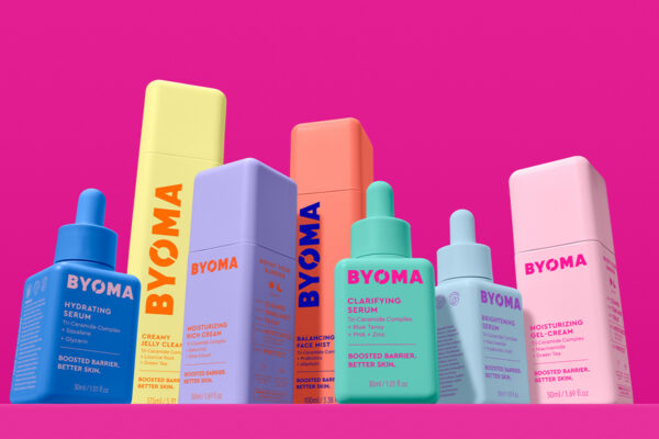
Byoma builds its range on rounded bottles, tubs, and tubes that read as one family, with no hard edges anywhere in the line. Every product gets a single saturated color, so the collection lines up on a shelf like a set of blocks waiting to be arranged. Designed by Pearlfisher.
Systems Worth Collecting and Displaying
Generation Alpha also interacts with products through collecting and display. Trading cards, character collectibles, beauty products, and other category systems encourage consumers to assemble groups of related objects rather than view each product independently.
Packaging can support the same behavior.
Brands such as Bubble and Byoma use consistent shapes, recognizable color coding, and coordinated product families that remain distinct while looking cohesive when displayed together. The individual package still communicates its specific function, but the broader range creates a visual system.
That approach changes packaging’s role. A container no longer disappears after communicating the product at purchase. Instead, it may remain visible on a bathroom counter, desk, bedroom shelf, or social media post.
Designing for that second life means considering how packaging works on its own, within a product family, and as an object consumers may choose to keep in view.
Two Readers, One Composition
Packaging aimed at Generation Alpha often serves two audiences at once: the younger consumer who wants the product and the adult who decides whether to buy it. Those audiences may prioritize different information.
The younger consumer may respond first to color, character, shape, tactility, or overall personality. Parents and caregivers may look more closely at ingredients, age guidance, safety information, product claims, and sustainability messaging.
An effective packaging hierarchy lets both layers coexist. Emotional appeal can attract younger consumers while clear information helps adults evaluate the product.
This balance becomes especially relevant in categories such as beauty and personal care, where brands increasingly reach younger audiences. A visually mature package may appeal to children who want products that don’t feel overtly juvenile, while clear communication helps adults understand what the product offers and how to use it.
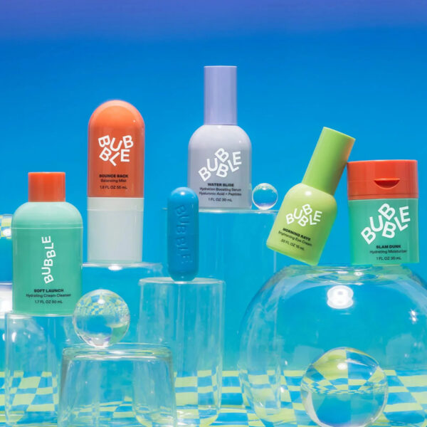
Bubble builds its skincare range as a set. Each product is a saturated block of color under a chunky rounded typeface that reads across a whole shelf at once. Design developed in-house by Bubble.
Designing for a Generation That Keeps Looking
Generation Alpha’s influence on household purchasing will continue to grow as its oldest members move further into adolescence. Their expectations are developing within an environment where physical products, digital interfaces, entertainment, and personal identity increasingly overlap.
For packaging designers, the opportunity isn’t simply to make children’s products quieter or more visually sophisticated. It is to understand how younger consumers recognize, organize, photograph, display, and assign meaning to the objects around them.
The packages that succeed in that environment may be those that balance personality with restraint, work as part of recognizable systems, and communicate clearly to both young consumers and adults. For brands, understanding those expectations is increasingly important to designing packaging that earns attention—and a place in consumers’ everyday lives.

Hernán Braberman is Partner and Creative Director at Tridimage, a packaging design agency in Buenos Aires. He leads design projects for major consumer brands and is also an international speaker, Branderman podcast host, and juror for top packaging design competitions.