
How Back-Panel Packaging Design Can Build Brand Loyalty
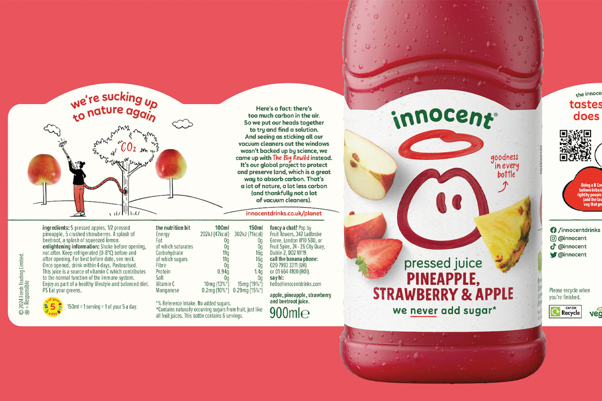
Back and side panels combine storytelling, regulatory information, and design to strengthen packaging communication and build brand loyalty.
A consumer and a package share an intimate moment that few brands design with the same intention they reserve for the front. It arrives once the product is home, resting on a counter or held in a hand, and the person turns the container to read what’s on the back. That daily gesture, repeated millions of times, opens a conversation that decides whether a second purchase happens.
You can also read: Why Emotional Packaging Matters to Younger Consumers
Calling the side and back surfaces secondary is a habit of language that underestimates their strategic weight. Panels of dialogue describe them better. The front competes for a glance on the shelf with seconds to spare. The reverse has minutes, in an intimate setting free of retail pressure.
The Space Where Loyalty Is Decided
Creative investment concentrates historically on what gets seen first, since the shelf demands stopping power. Once the product leaves the store, the back and side panels take over, and repurchase is built there. Brands that understand this treat the reverse as an editorial channel. Innocent printed a small humorous line at the base of a carton suggesting the consumer open it from the other side, a complicit gesture placed in a zone most brands consider purely functional.
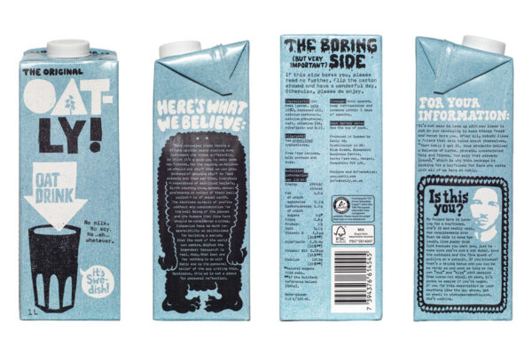
Oatly announces its regulatory panel as “The Boring (but very important) Side” and invites readers to turn the carton, converting a legal obligation into tone of voice. Design by Forsman & Bodenfors.
Thinking Like Journalists, Writing Like Editors
These panels reward an editorial mentality. Every available surface calls for the decisions a writer faces on a page: headlines that catch, concise copy, keywords given room to breathe. Typographic hierarchy organizes the reader’s path.
Separating regulatory information from brand content early in the process protects both voices. Visual coding through color, typography, or composition keeps each block legible, particularly in bilingual layouts where saturation grows. Oatly precedes its regulatory section with a warning that the area may be tedious, inviting the reader to rotate the pack for something more entertaining.
The Aesthetic Function of Technical Elements
Obligations can become expressive opportunities. The barcode accepts graphic intervention while bar widths stay within GS1 tolerances and optical readers remain accurate. Icons carry similar potential, simplifying complex information and crossing language barriers, and that power dissolves when they arrive as decoration. Instructions, recipes, and recycling protocols follow the same logic: clarity and visual appeal share the same surface.
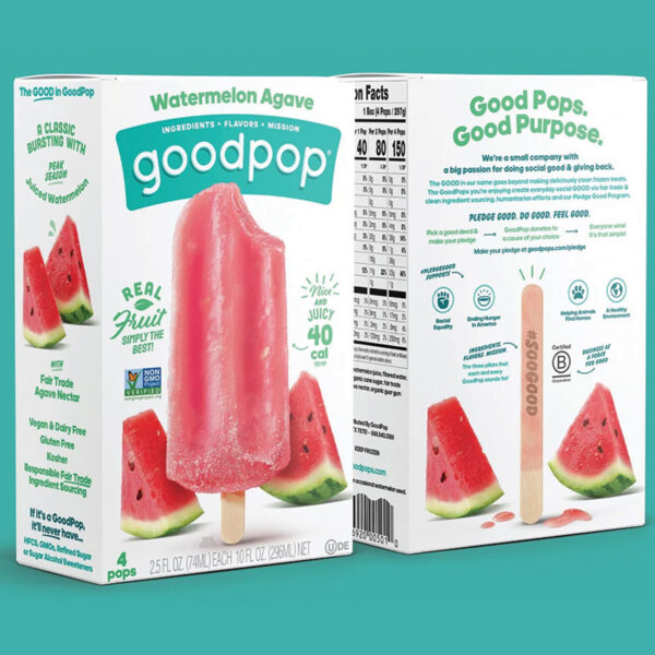
GoodPop reserves the back of the box for its Pledge Good program, with a consumed pop stick echoing the intact pop pictured on the front. Design by Interact Brands.
The Back Panel in the Age of Algorithmic Discovery
AI assistants now mediate purchase decisions by reading structured attributes, declared ingredients, certifications, and origin data. That content lives on the reverse of the pack and in its digital equivalents, so editorial quality there affects product traceability across conversational systems and retail media. Unboxing on camera exposes what a consumer once read in private to thousands of viewers at once. An ambiguous claim or a mishandled hierarchy translates into lost algorithmic visibility.
Design maturity reveals itself in what it removes. A package reaches its full form when nothing superfluous remains, and the panels of dialogue are where that discipline becomes most visible. Designing the reverse with the ambition given to the front turns a utilitarian object into a conversation, one of the most valuable assets a brand can build.

Hernán Braberman is Partner and Creative Director at Tridimage, a packaging design agency in Buenos Aires. He leads design projects for major consumer brands and is also an international speaker, Branderman podcast host, and juror for top packaging design competitions.