Bold Minimalism in Packaging: Clarity That Wins Attention

Bold minimalism uses negative space, typography, and color blocks to improve shelf impact and thumbnail readability in digital commerce.
Digital life compresses attention and increases cognitive load. Consequently, packaging competes against overstimulation, not only against adjacent SKUs. As information density rises, consumers increasingly reward visual restraint that feels intentional and confident.
You can also read: How Packaging Pictograms Shape Consumer Decisions in Seconds.
Gen Z experiences constant input across feeds, messages, and commerce platforms. Therefore, they respond to designs that reduce complexity and signal certainty quickly. Bold minimalism answers that demand by stripping elements to essentials and amplifying what remains through scale, contrast, and discipline.
The Architecture of Impact
Bold minimalism creates impact through radical reduction and strict hierarchy. Compared with earlier “neutral minimalism,” this approach uses fewer elements but pushes them harder. As a result, each surviving element carries more visual and semantic weight.
First, designers maximize negative space to create breathing room on crowded shelves. Next, they use solid color fields to establish immediate recognition and legibility. Finally, they commit to one dominant idea—logo, wordmark, or symbol—rather than stacking competing focal points.
Typography becomes the primary design tool in many systems. Heavy-weight geometric sans serifs often operate at poster scale, so the package reads instantly. Moreover, high-contrast pairings create shelf presence without adding visual noise. In practice, scale and spacing do more work than ornament.

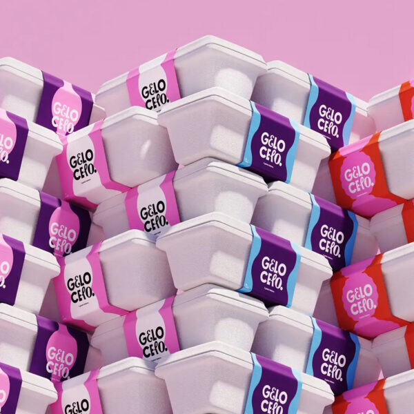
Gelo Celo uses a bold logomark and strong color blocks to create variation without visual clutter. Design by Boo Republic.
Clarity as a Digital-First Requirement
Gen Z rewards packaging that communicates certainty and purpose quickly. Therefore, color systems remain constrained and repeatable, usually with one or two hues and a controlled accent. Flat color blocks photograph cleanly and remain consistent across cameras, filters, and lighting.
This constraint also improves performance at thumbnail scale. When a package reads clearly in a small frame, it performs better in e-commerce grids and social feeds. As a result, bold minimalism becomes inherently shareable because it looks deliberate and uncluttered.
Copywriting also shifts under this model. Claims become short, specific, and easily verified. Instead of inflated language, brands use microcopy that explains function, ingredients, or usage directly. Consequently, packaging acts as a credibility device rather than a persuasion device.
System and Consistency Across SKUs
Bold minimalism succeeds when teams treat it as a system, not a one-off aesthetic. Variants typically change one variable at a time, such as color, flavor name, or a single icon. Meanwhile, the grid, margins, and typographic rules remain fixed to preserve recognition.
This discipline reduces visual drift as portfolios expand. It also helps brands scale without re-inventing the design language for every launch. Therefore, a consistent system becomes an operational advantage as well as a brand asset.
Designers typically choose one hero element and protect it aggressively. For example, a brand can emphasize an oversized logo or an oversized product name, but not both. This rule prevents internal competition and preserves immediate legibility.

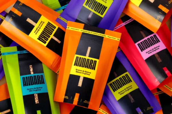
Andara builds impact through radical reduction, using a monogram frame and a vivid palette to break category conventions. Design by Boost.
Precision Without Sterility
Bold minimalism often overlaps with science-forward visual codes. Clean layouts, clear data blocks, and restrained palettes can signal efficacy and process control. However, teams must avoid drifting into sterile, pharmaceutical aesthetics unless the product benefits from that association.
Designers often add warmth through small, controlled cues. For example, a soft gradient, a friendlier serif, or a tactile material finish can humanize a clinical layout. Consequently, the system retains authority while staying approachable.
A single distinctive detail often becomes the signature. A minimal icon, typographic seal, or material twist can differentiate the brand without breaking the rules. In other words, the punctuation creates identity while the system protects clarity.
The Future of Less
Bold minimalism reflects a strategic shift in how brands communicate value under attention scarcity. As consumer sophistication increases, brands gain more by trusting product quality than by stacking claims. Therefore, simplification becomes a signal of confidence rather than a lack of effort.
In saturated categories, the most effective move can be reduction. Silence can outperform noise when design systems execute with precision. Ultimately, bold minimalism maximizes impact by treating clarity as the core feature.
