Packaging Color Strategy for Stronger Shelf Impact

In a marketplace saturated with chromatic abundance, brands face a fundamental choice about color strategy that extends far beyond aesthetic preference.
The science of color perception reveals that hue is the sole visual stimulus our eyes process without focused attention, making it the first signal that guides shoppers through retail environments. Yet this decisive advantage carries strategic complexity that many packaging designers underestimate.
You can also read: Color Coordinates
The Chromatic Shortcut
Color creates immediate emotional connections. Research shows that 52 percent of shoppers register color first when scanning products, making it the primary driver of visibility. Coca-Cola’s red communicates joy. Cadbury’s purple conveys royalty. These associations become so deeply embedded that changing brand colors can increase average recognition time by 1.2 seconds, potentially jeopardizing selection at the critical moment of purchase. The brain relies on learned color categories to process visual information rapidly, making chromatic consistency essential for automatic brand identification.
This reveals color’s strategic power: it functions as the fastest route to consumer memory. While typography and symbols provide structural identity, color delivers the emotional shortcut that drives split-second decisions in competitive retail environments. Color accelerates recognition and deepens connection, functioning as the emotional multiplier of solid visual identity.
Three Strategic Approaches
Packaging design presents three distinct color strategies, each with specific advantages for different market positions.
- Brand color consistency creates unified visual presence through repetitive color across all variants. This approach leverages the billboard effect: accumulated chromatic mass signals brand strength through perceived market dominance. When products share identical background colors, they aggregate visually on shelf, making the brand appear larger than its actual facing count. This perceived size translates directly to consumer trust through social proof mechanisms. However, this strategy risks appearing rigid when extensive variant differentiation becomes necessary.

Feastables’ redesign embraces a unified brand color consistency approach as its singular chromatic signal. What was once a fragmented, flavor-shifting palette now becomes a powerful, cohesive brand block, creating shelf impact and reinforcing continuity across every consumer touchpoint. Design by Interact.
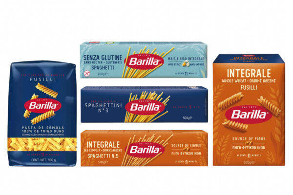
- Category color coding assigns specific colors to product segments or subcategories within a portfolio. This strategy maintains a dominant brand color while introducing distinct secondary colors for functional or benefit-based line extensions. The approach facilitates consumer navigation, allowing shoppers to locate specific product attributes quickly while maintaining overall brand cohesion through consistent structural design elements and hierarchical color application.

Barilla’s chromatic architecture demonstrates a refined use of brand color consistency, where the iconic blue acts as a cognitive shortcut for instant recognition, while categories such as whole wheat and gluten-free introduce secondary hues without compromising the masterbrand’s cohesion. Design by Robilant.
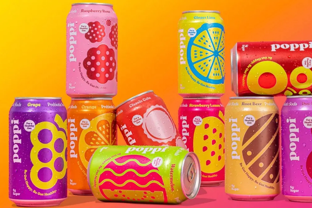
- Flavor color expression dedicates full background color to individual variants, creating vibrant shelf presence through chromatic diversity. This strategy, sometimes called the rainbow approach, feels contemporary and sensorial. The risk emerges when expansion fragments brand block, making each new variant further divide visual territory rather than strengthen collective presence.
The Unity Principle
The most successful brands recognize that unified color makes brands appear larger on shelf, and perceived size translates directly to trustworthiness through social proof. When chromatic fragmentation threatens brand block integrity, strategic redesign can restore commanding shelf presence without sacrificing variant clarity.
The optimal approach establishes clear hierarchy: the brand leads through dominant color; variants follow through strategic accent colors. This ensures that portfolio expansion strengthens rather than dilutes shelf impact, maintaining visual authority while accommodating product diversity. As brands continue navigating the tension between recognition and differentiation, color strategy reveals itself as neither decoration nor afterthought. It shapes the fundamental architecture of market presence.
