Perfectly Imperfect: How Freak Design Captures Gen Z Authenticity
Forward-thinking brands are discovering that embracing unconventional, quirky, and deliberately flawed designs creates profound resonance with younger consumers.
A transformative shift occurs in packaging aesthetics where calculated imperfection has become a powerful strategic choice.
You can also read: The Unboxing Revolution: Reimagining E-commerce Packaging Design.
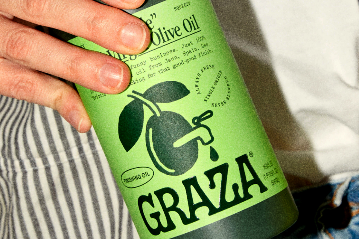
In today’s hyper-curated world, packaging that breaks conventions through intentional awkwardness stands out in striking contrast to the polished uniformity that has historically dominated retail spaces. Freak Design’s philosophy celebrates authenticity through deliberate departures from traditional design norms.
Beauty in the Flawed
The emerging consumer generation actively rejects artificial perfection in all forms. They champion unfiltered authenticity and view idealized imagery with inherent suspicion. This cultural shift has given rise to packaging design that boldly celebrates character over conventional beauty, personality over polish, and raw expression over refined aesthetics.
Traditional marketing has historically leveraged aspirational imagery to sell products. The Freak Design approach inverts this completely. Consider innovative skincare brands that transform previously stigmatized conditions into celebrations, using bright, eye-catching patches that turn blemish treatment into self-expression rather than concealment. These products communicate through authenticity rather than idealization.
Conventional Design Disruption
The most successful practitioners of this design philosophy create packaging that deliberately disrupts visual expectations. Their approach is characterized by unexpected color combinations, asymmetrical compositions, and typography that might appear amateurish to the uninitiated eye. Yet these choices represent calculated decisions to communicate honesty and individuality.

Starface pimple patches package features a vibrant neon backdrops with star motifs and a minimalist smiley face, transforming acne treatment into celebratory self-expression. The deliberately childlike typography and bold color choice rejects stigma through joyful design. Design by Someone & Others.
Brands embracing this aesthetic often employ iconography that challenges industry norms, using crossed-out logos, deliberately misaligned text, and statements that read more like candid admissions than marketing copy. The underlying message consistently emphasizes genuineness over commercial perfection.
Differentiation Through Nonconformity
The strategic brilliance of Freak Design lies in its inherent exclusivity—if a package leaves certain consumers confused, it’s likely connecting perfectly with its intended audience. When traditional product categories become visually indistinguishable, deliberate oddity creates immediate recognition.
In markets saturated with predictable visual language, the courage to implement unconventional ideas delivers remarkable differentiation. This approach repositions authenticity as raw and unfiltered rather than carefully constructed, replacing meticulous precision with refreshing spontaneity.
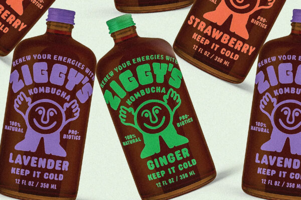
Ziggy’s Kombucha bottles feature childlike cartoon in vibrant monochromatic color schemes. The deliberately imperfect typography and illustration style reject clinical wellness aesthetics in favor of playful, approachable. Design by Office Hours.
Human Imperfection Becomes Valuable
Hand-created illustrations and casual typography provide a welcome contrast to the increasingly algorithmic aesthetic dominating visual culture. As digital perfection becomes commonplace, human imperfection becomes increasingly valuable. These design elements prioritize emotional connection over technical flawlessness.
Understanding this shift is crucial for packaging professionals seeking to connect with younger demographics. This generation values a wholehearted commitment to authenticity over partial measures. While they don’t demand perfection, they insist on genuine expression. Ultimately, Freak Design represents more than a passing trend—it’s a strategic response to a fundamental evolution in consumer values.
Hernán Braberman – Creative Director, Tridimage